Age: 34 Why him? No one revels in the possibilities of the jewelbox like this Austria-born CD designer. Sample innovations: a holographic disc (Marshall Crenshaw's Miracle of Science) and a perforated booklet (Skeleton Key's Fantastic Spikes Through Balloon). What inspires him: New York, where he lives and works. His cover for H.P. Zinker's Mountains of Madness--a senior whose face turns to rage when the booklet is slid out of its case--resulted from an encounter with a homeless man: "He suddenly started to freak out, shouting obscenities. It stuck in my bones." Creative crutches: "My espresso machine. And a pack of Lucky Strikes." What's next: A foray into cardboard packaging, for an upcoming Pat Metheny Group album.
Title: Stefan Sagmeister
Authors: Ascher-Walsh, Rebeccca. Baldwin, Kristen
Source: Entertainment Weekly; 06/27/97, Issue 385/386, p63, 1/4p, 1 color photograph
doc type: Article
ISSN: 10490434
Database: MAS Ultra-School Edition
Section: DIALOGUE
DESIGNER ON SABBATICAL
in conversation
Sagmeister Inc.'s Experimental Outcamp is located in Bali, Indonesia, far from Stefan Sagmeister's headquarters on "wonderful West 14th Street" in New York City. For the second time, Sagmeister is scratching the proverbial "seven-year itch" by dropping out for an entire year, leaving clients behind, to refresh and renew himself as a designer and artist. Sagmeister began his first client-free year in 2001, when he was 38, and he is now beginning his second at 46. He says he has only two more sabbaticals to go before his retirement age of 65 and argues that it is much more useful to take those years early, interspersed throughout his working life, rather than pin them to the end of it. In fact, after it became clear that the ideas he developed during his first sabbatical subsequently inspired his most successful design projects, he became convinced that he needed to make a respite integral to his creative regimen. How many of us dream of doing the same? Sagmeister has certainly become a model for those who can consider such a radical leap; for the rest of us, we'll live vicariously. It was in this spirit that I caught up with him via e-mail to find out how, a few months into this adventure, his expectations are meeting reality; what inspired him to select Bali; and what he misses, if anything, now that he's so far away.
HELLER: This is your second in a seven-year cycle of "sabbaticals"; what gave you the idea to make this a regular part of your life? SAGMEISTER: My desire for the initial experimental year had many reasons, among them my experience that I often did the best thinking in time periods without pressure. After my studies, I had moved from city to city every two years, so this kind of thinking was often done in between jobs and places. After running the studio in New York City for seven years, I had no intent to move again, so this year allowed for time to explore. Ferran Adrià, who is now considered by many to be the best chef in the world, closes his restaurant north of Barcelona for six months every year--while keeping a full kitchen staff--in order to experiment. That's half of his time put aside for experimentation, compared with my paltry 12.5 percent. If this second year turns out to be as enjoyable and influential for the subsequent work as the first one, I might increase the percentage considerably. HELLER: Did anything else specifically trigger this? SAGMEISTER: When the 60-year-old Ed Fella visited our studio in New York and brought a number of his fantastic four-color ballpoint typographic experiments, I was completely blown away. He self-mockingly called it "exit art"--art he does before he dies. I was in love with the sheer inventiveness and quality of the work and at the same time felt that it would have had a bigger impact on a working life if interspersed regularly throughout one's life. HELLER: HOW easy is it to put your client-driven work on hiatus for an entire year? SAGMEISTER: I had all sorts of fears before the first year--that we will lose all our clients, that we will be forgotten, that we'll have to start from scratch. As none of these fears became true the first time around, I started this second one with few worries. For me, it was simply a matter of proper time planning. I just put it into the plan agenda, worked out the finances, and told the clients. HELLER: What appealed to you about Bali for your year away? SAGMEISTER: I had spent the first sabbatical in New York City because the idea of doing this was as big abite as I could take at the time. As I wanted the second year to be different, my initial thought was not New York. I know the U.S. and Europe too well to generate much excitement--I couldn't see myself in Arizona for a year-and don't know South America and Africa well enough. So Asia it was. I had worked in Hong Kong for two years and know it a bit--and the two most beautiful landscapes I had seen in Asia were Sri Lanka and Bali. As Sri Lanka still has a low-level civil war going on, my decision fell on Bali. Aside from the possibility of living in the jungle and at the same time being five minutes away from a small town that would not only have good restaurants but also sell printer cartridges, it was the incredible craft culture that attracted me. There are entire villages of woodcarvers, stonemasons, wig makers, textile weavers, and silversmiths close by. HELLER: Is there anything you regret about leaving for a year? SAGMEISTER: The Obama campaign asked me to design a poster, and I was really sorry to not be able to oblige. It was just before my sabbatical started, and I had sworn to myself that I would not take anything on, no matter how tempting. And anyway, I am very aware that the tiny influence my little poster might have had would be only on the converted. HELLER: I can't help but presume part of your retreat is a critique of contemporary practice. Do you believe that the contemporary design language is vital or stagnant? SAGMEISTER: There is lots of good design work being done today. I think of Ji Lee, or Rick Valicenti, or Marian Bantjes, or Maira Kalman, and many more. It is true, though, that most people I really admire have experimentation institutionalized into their practice. HELLER: In your own work you play with various forms--there is never a single stylistic underpinning. Do you foresee a new aesthetic emerging from your travels? SAGMEISTER: Today I badly copied a page from an 18th-century Turkish Koran I had seen in the Museum of International Muslim Art in Kuala Lumpur. I truly hope this has an influence on my aesthetics, as typography rarely reached a pinnacle of such absolute and total gorgeousness as it did in 15th- to 18th-century Islamic culture, which didn't allow pictorial imagery. All the creative desires had to go into type and ornamentation. HELLER: You are connected, albeit intermittently, to the rest of the world. How do you determine who and what to let through the doors during this year? Are there any demanding clients who must talk to you now? SAGMEISTER: NO. All clients were warned as much as two years in advance, and most were envious. So far, they are all very respectful. And of course it helps a lot that Joe Shouldice is in the studio in New York City, keeping a low profile while finishing up some jobs and being there to answer questions. Richard The and Joe just installed a new maxim in Amsterdam, "Obsessions Make My Life Worse and My Work Better." It consisted of 250,000 Eurocents carefully and painstainkingly laid out with the help of many, many volunteers in a public space in Amsterdam. [Editor's note: The coins were removed by Dutch police, who worried about theft.] Other than that, we shifted all possible new sentence installations to September 2009. HELLER: But what have you actually learned so far? SAGMEISTER: When attacked by hollow-eyed Balinese dogs, I can make them scatter by pretending to pick up a stone. HELLER: So, are you happy? SAGMEISTER: As I am very aware how boring it is to hear about other people being happy, I say only this: I get up every morning at 5 a.m. simply because it's more exciting to start working than to turn around and sleep some more. I do seem to have a lot of energy. After enjoying a giant pot of coffee and a medium-sized cigar for breakfast, I start my daily schedule of little experiments. This is coming along very well.
Title: Stefan Sagmeister
Authors: Heller, Steven
Source: Print; Feb2009, vol.63 issue 1, p34-36, 2p, 2 color photographs
doc type: interview
Abstract: The article presents an interview with designer Stefan Sagmeister. Sagmeister discusses how artist ed fella influenced his decision to take a sabbatical from his clients at his design firm Sagmeister inc. to experiment with different art techniques. He comments on his visit to Bali, Indonesia and how he was inspired by the typography of a Turkish version of the Koran on display at the Museum of International Muslim Art.
ISSN: 00328510
Database: Academic search premier
Section: HOMAGE: Notes on an anniversary
Some leading lights look back at their first encounters with Print
SINCE PRINT HAS SPENT 70 YEARS covering legendary design, it stands to reason that the magazine has been read by at least a few legendary designers. I tracked down some of them to get their favorite memories of Print, and I was not the least bit surprised when I learned that Milton Glaser had prepared his answer more than four decades before I asked him. "En 1962 — a lifetime ago — I was quoted in response to Pratt's question of 'Where is graphic design going?'" says Glaser. "I responded, 'The trend is eclectic and elaborate.' Probably still true."
"I remember really looking forward to seeing the next issue, always," Massimo Vignelli tells me, even though, for the Italian expatriate, Print was still too, um, American for his taste. "The magazine was always reflecting the American approach to our profession, which has always been too commercial, rather than the European approach, which was more intellectual."
According to Michael Bierut, however, that was precisely the beauty of the publication. He says, "I think its two legacies are actually resolutely populist: the Student Cover Competition and the Regional Design Annual. Over the years, they both provide unvarnished snapshots of the state of American design, in the schools and in the profession, for good or for ill — and if you doubt the latter, just look at some back issues."
The Student Cover Competition is what most designers remember first led them to Print. "My earliest memory of the magazine was entering the competition — a long, long, long time ago — and receiving an honorable mention." remembers Michael Vanderbyl. "What an honor that was for a young art student!" Stefan Sagmeister also recalls entering that competition more than 20 years ago, but his pride is in the work he did that was left out. "I had constructed a fairly elaborate section of a stone wall featuring an ancient Egyptian man — looking at a printing proof in front of an offset press — complete with erect penis," says Sagmeister. "The image never appeared in Print. I still like to believe it was the penis that did the entry in."
Quite a few designers remember specific issues as being culturally influential, including the 2004 Sex Issue, a favorite for many. Ken Carbone has fond recollections of the July 1969 Black and White Issue, in which then-editor Martin Fox asked 40 influential designers, including Paul Rand. Glaser, Paul Davis, Ivan Chermayeff, and Herb Lubalin, to interpret the theme. "Most took on the question of race in America," says Carbone. "The range of designs was compelling in [its] simplicity and represents a wonderful time capsule of thought on the social attitudes of the age. This issue was a keeper, and looks as fresh today as it did 40 years ago."
Paula Scher, who has contributed to numerous issues of Print, remembers the parody issue that she created with her friend Steven Heller in 1985. "I made my first Print cover, which was a genealogy chart of graphic design where famous characters from history slept with typefaces and the whole thing begat Milton Glaser," she says. "I persuaded Marty Fox to include a designer friend of mine in this parody issue that Marty had never heard of. His name was Tibor Kalman. Tibor contributed art to a piece on creating a graphic identity for Canada."
Being tapped to contribute to the magazine was a high point for many. "When I did my piece for Print,! was given the opportunity to write and paint about Jane Austen, Crazy Luba, and the pyramids of Giza," remembers Maira Kalman. "What could be better?" Rick Valicenti remembers being delighted when asked to produce a full page for the Italian issue. "The foregrounded crying religious icon was set off with a backdrop of my son's NinjaTurtle blankie, complete with a shallow depth-of-field view of Michelangelo, Leonardo, Donatello, and Raphael," he says. "In the corner was a can of Franco-American SpaghettiOs, and somehow it all made sense to me. I was thrilled to have been so prominently published in Print."
Debbie Millman's first assignment came especially fortuitously in 2003, as she slid into a seat on a crowded plane while grappling with an embarrassingly large Sausage McMuffin. "I looked at my chic and breezy neighbor and blurted out an apology for my overall slovenly, McDonald's-laden self," she recalls. That neighbor, Millman was amazed to learn, was then-editor-in-chief Joyce Rutter Kaye. "Several months later, I was assigned my first piece for Print, and I have contributed to nearly every issue since that fateful day," says Millman. "After my first piece was published, I asked Joyce to join me for dinner to celebrate. She agreed, with one caveat: no McDonald's."
Many designers are able to trace major milestones in their careers to being published in Print's pages. Paul Sahre recalls when Print writer Phil Meggs came to town to write about "edgy Baltimore." He says, "It was 1995, and I was a few years out of school, working at an advertising agency, paying the bills, but it was the series of silk-screen posters I was doing off hours for a local theatre that Meggs wanted to talk about." Sahre used the opportunity to complain about his job and the state of advertising, which (along with other events) got him fired. "I guess I owe Print a huge debt of thanks," says Sahre. "That job sucked."
For Armin Vit and Bryony Gomez-Palacio, who began working as designers in Mexico City more than a decade ago, the magazine changed the course of their work, which in turn ended up transforming the discipline itself. "We were blind to the existence of a design world outside our classrooms, and we luckily stumbled upon several copies of Print, giving us a peek into this vast world of graphic design history, practice, and criticism that expanded into the whole world itself." Soon enough, they became part of the ongoing evolution of the profession. "Who would have thought that a decade later, our blog, Speak Up, would be in the view of Rick Poynor's 'Observer' column in the May/June 2007 issue, which provoked hundreds of comments and a (friendly) war of words between blog and magazine, editors and noneditors, bloggers and writers?"
In fact, it's that ongoing, 70-year-long conversation that has allowed Print and its growing community to nurture several generations of designers within its pages. "My most vivid memory of Print is how Marty Fox encouraged and supported me and others," says Deborah Sussman. "It was an honor to be approached by Marty and published in Print, And it still is."
Title: Design Revelation
author: walker, alissa
source: Print; feb2010, vol. 64 issue 1, p18-19, 2p, 3 color photographs
doc type: article
issn: 00328510
database: academic search premier
abstract:The article focuses on the major milestones in the careers of some legendary designers of the magazine "Print." Designer Stefan Sagmeister recalls entering the journal's Student Cover Competition which first led him to work for the journal. Designer Paula Scher with her friend Steven Heller created the parody issue in 1985 which was a genealogy chart of graphic design. The magazine changed the course of designers Armin Vit and Bryony Gomez-Palacio.
"Just doing good work is tough," says Stefan Sagmeister, for whom good work is not a matter of surface and styling. He does good work. See, especially, his music packaging.
The designer is "motivated by personal considerations whereas the inventor seeks to transform the problem into one where the essential properties of structure, material, or some other impersonal element are being expressed," wrote British structural engineer Peter Rice. Although Rices field was architecture, he might easily have had the work of Austrian graphic designer Stefan Sagmeister in mind. What Rice sought to convey was that a deep understanding of materials and structure can make real the presence of another dimension in design, so that viewers want to touch an object and interact with it. This kind of understanding--awareness of the tension between design and invention, thinking and making, content and execution--is Sagmeister's domain. Even the simplest of his designs is animated by a sense of how something is made. Yet concept, the ability to generate an original idea, is his deepest preoccupation, and Sagmeister refuses to spend much time worrying about production issues. "I'm not interested in surface or in styling. That is something that comes long after the concept, at the very end of each project--often at the last minute. Then you push it to look as good as possible. What I'm interested in--it all sounds so simple-minded--is strong imagery, design that actually works."
However casually put, "design that actually works" is harder to achieve than one might think, particularly for a designer who finds complacency anathema. "The toughest part of the business is just doing good work," Sagmeister asserts. "The biggest trap for me is stopping when something is kind of nice rather than finding the energy to go back and push myself to do something really good, to not be satisfied with something just above mediocre. That's a condition that comes with comfort. You feel pretty snug in your studio. Your job is fine. Nothing is too wrong in your life. So you sort of say, well, that's not bad, let's just do it like that. Fortunately, if I do it like that for too long, I get Incredibly unhappy."
Sagmeister is a man who likes to enjoy himself. He is wild about music--among other things, he has a vast collection of compact disks, and keeps unhappiness at bay by putting his professional talents at the service of the music industry. Indeed, musicians, record companies, and music studios account for 50 per cent of his client list. But while his pleasure in collaborating graphically with musicians like Lou Reed, Aerosmith, and David Byrne (with whom he worked on his latest release, "Telling Stories to the Sea") has brought him both personal reward and critical attention, the satisfaction he derives from his work encompasses a broader spectrum. At a time of upheaval and diversification within the graphic design profession, when nearly everyone seems to be moving into multimedia, Sagmeister says that his assignments are "all print" and include--besides CD packaging--corporate identity, brochures, and advertising. Last year, for example, Sagmeister oversaw the positioning and identity program for the U.S. launch of an innovative toilet seat whose sculpted forms resemble the petals of a flower. The Tokyo-based client, TOTO, is the world's largest bathroom fixture manufacturer, and despite the distance and modest size of Sagmeister's studio (nearly all the creative and client relations work is divided among Sagmeister, his assistant, Veronica Oh, and a rotating intern), awarded him a project that a decade ago would probably have gone to a large agency. He scrutinizes every project that comes in and, relying on his intuition, turns down work that seems inappropriate. "Saying no to a potential client comes easy when you don't want to grow in size. I want to grow in quality and in the kind of assignments I do, but not in size. To picture myself ten years from now heading a design group with 100 employees and offices in Rome, Tokyo, and Helsinki would be a horror. I'd think, 'I've failed.' " Where he has succeeded is in the quantity of CD packaging he has designed, which, despite fees that are low compared to those for some of his other projects, is the business focus he prefers.
"Graphic design is a step down from music," Sagmeister says unequivocally. "I get much more of a kick out of listening to music than I get out of looking at graphic design. Absolutely. I get more uplifting moods or involvement from music than I ever got from graphic design. Of course, a graphic designer does have some significance within the culture, but it is an itsy-bitsy little sand grain of influence."
Expressing one creative medium through another is an ancient practice. For the graphic designer, book jackets, theater posters, and music videos offer precisely that kind of creative challenge. Certain artistic forms, as most of us have witnessed, translate more readily than others. Painting and sculpture, for example, do not capture well on film. Architecture, on the other hand, translates well into film, but inevitably appears flat when photographed. Music, perhaps the most universal of the arts, has a mystery about it that works as a powerful force for unleashing the imagination. "I love to design CD covers because the medium is so great," Sagmeister says enthusiastically. "They're small. You can put a ton of work into them so that the design has a real connection to the contents. They are one of the few forms of packaging that doesn't wind up in the garbage--every-body keeps them. People really appreciate it when the design enhances their experience of listening to the music." One haunting example is the CD package he designed for the American hardcore band Pro-Pains "The Truth Hurts" release. The cover features an eerily captivating photograph of a female cadaver fresh from the morgue. The young woman, apart from the long, sewn gash running the length of her torso, sleeps as peacefully as a character in a fairy tale. Inside, Sagmeister introduces a sense of time through an unfolding sequence of crime-scene photographs taken by Weegee for the Manhattan Municipal Archives. And when designing the liner notes for the European jazz ensemble Songs of Maybe's album of the same name, which has a religious quality, Sagmeister looked to the Bible for inspiration, incorporating a thin ribbon page marker and transparent parchment paper to lend the text the appearance of scripture.
CD packaging challenges the designer to make music visible and expand its meaning. By bringing a sense of discovery to the temporal and tactile experience of the packaging, Sagmeister is able to express the music's intrinsic character. Because of his own profound emotional involvement in the music, he has made the listener's perception of it more vital. To achieve these results, Sagmeister insists on early collaboration with the musicians. "First," he says, "the band comes with a pre-tape, usually before the mastering. I talk to them about what they think the music is about, not about visual ideas. We want them just to talk about why they wrote a song. Then before we begin the project, we just play the tape over and over again in the studio, but without really listening. Just as background music. Then, from what they tell me they think about and what I know I think about, we start with a concept." For the New York underground band H.E Zinker's "Mountains of Madness" cover, Sagmeister shows how the city affects the minds of its inhabitants by contrasting expressions of calm and anxiety on the face of a homeless man he saw in the street. He combined the two images as a red jewel case with a green insert, a package that superimposes one expression on the other to suggest that one state of mind is always just below the surface of the other. For a Ryuichi Sakamoto & YMO 1994 release that he worked on as a designer at M&Co., he created ten different cover designs, each with a coded message by conceptual artist Jenny Holzer that is legible only when slipped into the jewel case. The listener derides which cover design will appear.
Much of Sagmeister's CD design has spun off into identity and advertising projects for finns in related professions, such as Schertler, a Swiss audio company, and DHA (USA), a post-production consulting company to advertising agencies. For DHA, he communicated the firms technological expertise through the unfolding of a sequence of black-and-white photographs used on various elements of the identity program.
Sagmeister's star rose early and shows little sign of dimming. In 1981, at the age of 19, he entered the Vienna School of Applied Arts, where, instead of regularly attending classes taught by professors whose relevance as designers, he believed, had long since passed into the archives, he formed a small design group with some fellow students called Gruppe Gut, or Good Group. Through Good Group, he was able to begin freelancing while still in school. His first client was Schauspielhaus, Vienna's biggest avant-garde theater. "The posters were hung everywhere in the city, which produced a lot of visibility," he explains. "Articles were written about them. From there, it wasn't very tough to get clients."
After a few years, Sagmeister won a Fulbright grant to study in Chicago. The lure of Manhattan, however, proved irresistible. He thought: Why go to Chicago when there is a New York? So he declined, reapplied the following year, was given a grant to study at Pratt Institute in Brooklyn, and was soon en route to America. After graduating from Pratt in 1988, he endured a series of mediocre design jobs with American firms for three years, and was consistently dismayed at what he perceived as a widespread belief that design was merely part of the fashion mill. "At times, I was very unhappy, because the direction of the firms then was very style-oriented," he recalls. "One season it was Vienna 1900, the next it was the '60s. Of course, I knew of M&Co. and must have called Tibor [Kalman] 40 or 50 times until he finally saw me. But he wanted a two-year minimum commitment, which at the time I wasn't ready to give."
After a year of boredom back in Vienna, he took a trip to Hong Kong to visit a friend. While there, he arranged to show his portfolio to several design firms merely as a pretense for visiting their offices. As it happened, the trip was a turning point: Out of it came a job offer from Leo Burnett, to work first as a typographer, and soon after to head their new design group, which is still active today. Sagmeister's rapid success, however, was gradually tempered by the realization that a life centered around making money but devoid of any real culture was ultimately a life worth abandoning. "In the end, yuppiedom made me leave," he says. "Hong Kong is incredibly rich and there is tons of business culture but no real culture as we know it in New York and Vienna."
Few experiences, however, could have better prepared him to return to New York and finally join Kalman at M&Co. than those two years in the Orient. He learned to maintain an intense pace and focus for such clients as Cathay Pacific, Regent Hotels, Standard Chartered Bank, and the Lane Crawford department store, and he gained invaluable client-relation skills. "It was an excellent opportunity for me because it gave me all the advantages of opening up my own design firm without any risk from investing my own money. Plus, we were incredibly busy. At times, we had 130 jobs open with a staff of five designers, so the pace was really chop-chop. And the incredible thing is that it was even possible to do good work. Of course, we did a mound of shit, too. Sometimes, though, you do much better work if the job comes in in the morning and you have to deliver mechanicals in the evening or the next day. Two hours for concept, two hours for design, two for production, and that's it. No time for interference." Two of the more memorable designs produced during that period are a notebook for Creasia (a 1991 creative conference held in Bangkok) that includes a real glass eye stored in a die-cut, and for Leo Burnett's biannual corporate retreat, Camp Leo, a conference kit organized into several small compartments containing pencils, paper clips, and other office necessities. In typically wacky fashion, the inside lid of the box was lined with illustrations of each of the presenter's brains.
Sagmeister is one of a generation of young designers now heading up their own studios--Sagmeister Inc. opened in 1993--who were inspired by the liberating, experimental atmosphere of M&Co. Though he had worked there less than a year before Kalman announced his move to Rome to work full-time on Colors, Benetton's bright, controversial, globally-circulated magazine, Sagmeister found the experience stimulating. "When Tibor closed M&Co., it was pretty clear that I would have to open something myself, because for me M&Co. was the best design firm in New York," he explains. "There was no one else out there I could imagine working for. It was the only firm where ideas were really the most important part of the project. To make it look good was something to be considered as well, but nobody was that concerned with production--if that yellow is really the correct yellow, if that paper stock is exactly right. In the end, for me, those decisions don't matter that much."
Kalman himself explains it this way: "M&Co. had such a bizarre relationship to the methodology and economics of the design profession that there were very few people who, after M&Co. closed, didn't open their own studios. M&Co.'s motivation was neither to exactly solve the client's problems, nor to make money, nor to make things look good. So, once I had beaten all that standard design criteria out of them, as designers their thinking was completely distorted and in terms of trying to go to another firm, they were deep in shit." Under the influence of this distorted thinking, many of those "after M&Co." firms have become very successful. "That's because they are asking the questions that need to be asked right now of the profession," Kalman explains. "By asking those questions, they come up with non-obvious solutions."
It follows that many of Sagmeister's projects address specific sets of problems in ways that have little to do with preconceived ideas or previous solutions. He has made a style out of having no style and a small sign in his studio--"Style = Fart"--encapsulates the prevailing philosophical approach. Access to Hong Kong's cheap, lavish production techniques during his years at Leo Burnett only deepened his belief in the integrity of ideas above all else. "Now, when I am forced to ask myself questions like whether or not something needs a varnish on it, it just means that the project sucks, that I didn't do my work. If the idea is strong, you can usually print it very simply and it should stand up."
What's special about Sagmeister's work is also its humor, lack of inhibition, and freedom from the rules and pretensions that the profession tends to produce. Six-feet-three-inches tall, lean and lanky, with thick dark hair swept back from his face like that of a 19th-century romantic, a charming way of crisply pronouncing favorite words like excel. lent, and a friendly, informal manner, Sagmeister is a designer who does not take himself or his profession too seriously. He clearly delights in stirring up mischief, in poking fun, in producing small shocks, For example, a call-for-entries for Hong Kong's advertising club featured an illustration of four Chinese men bending over with their pants down to moon the viewer. The image caused such a stir that the award ceremony was indignantly boycotted by the advertising agency Dentsu, Young & Rubicam, and the poster was reproduced on the front page of the South China Morning Post.
Because Sagmeister's current success is fueled by a roster of international clients, much of his work is executed and delivered electronically. However, as a practical designer concerned with thinking before making; he never begins a project by designing on the computer. Moreover, he dismisses any link between quality and technology. "If there is more good or bad work out there now, it's not because of the computer. Quality-wise, it's had very little impact. The people who did fantastic work before by cutting out typefaces by hand will do fantastic work on the computer. And the people who did shit work before will do shit work on the computer. The only thing that changed was that people who couldn't do any work before now do--at least in their own minds--professional-looking work. I would still say it is shit, but the difference is that now you are not stuck with only Courier on your typewriter. You can elongate and squeeze. Every assistant has 150 typefaces on the computer. Nobody hires a designer to design some stupid little newsletter that you can have done in-house if you send somebody to take a Quark XPress course for $400. That is pretty much what is happening. But I have no problems with that. That is technology.
"On the other hand, the computer has made everybody's quality of life worse. It's just nicer work to sit there with your knives and your twenty thousand different materials and all the little gizmos you have to achieve a special effect than to sit in front of a computer screen all day long. For us, the decision to do it on the computer versus any other traditional medium is made after the concept stage is completely done and finished. Then we ask, 'What is the best way to execute the concept?'
"We have so much designer waste. It's all just garbage, really. I find it important to ask, What does it mean to communicate a message? Could it just as easily be printed on newsprint and still work? Then, when you have an idea that really needs a brochure--well, it better be a damn good idea."
Knowing and understanding, thinking and doing, the process of moving between conception and execution are fundamental to Sagmeister's design. No matter how much emphasis is placed on the idea, the making and the thinking are in the end not separate but part of a continuum. His shake-it-up vision rendered darkly, humorously, and cleverly is compelling and memorable for just that reason.
Unless otherwise noted. Stefan Sagmeister was art director for items shown
Title: Shaking it up
author: Sherr, leslie
Print, 00328510, mar/apr96, vol. 50, issue 2
database: Academic search premier
Section: Merchants & Marketing
NEW YORK--Stefan Sagmeister designs only four or five CD covers a year. He knows he could make more money if he expanded his two-man studio and accepted all the work offered, especially now that he has been nominated for three Grammys and done the art for high-profile acts like the Rolling Stones.
But he realizes that an increased workload comes with a price--if he accepted more projects, he'd be spending much of his time in meetings rather than doing what he most enjoys: visualizing and executing design concepts for album covers and booklets.
Sagmeister, a 35-year-old Austrian now living and working in New York, is on a hot streak. His projects this year include covers for the Stones' "Bridges To Babylon," Skeleton Key's "Fantastic Spikes Through Balloon," David Byrne's "Feelings," and the Pat Metheny Group's "Imaginary Day." The work on another 1997 release, Aerosmith's "Nine Lives," was done last year. And each cover is as different as the music on the discs.
"I hope it's clear I try not to have a house style," he says. "Every project comes out of the music."
Tommy Steele, VP of creative services at Capitol Records, which released the Skeleton Key album, says, "Where I find he's most brilliant is with the concept--on many levels. In a very limited package, you think everything's been done. But he finds a new way to do it. Concept is king for me. It's about the idea. His ideas get carried out beautifully."
Sagmeister crafts his designs in a duplex penthouse apartment he owns on West 14th Street, aided by one other designer, Hjalti Karlsson, a native of Iceland, and an intern. Trained at the University for Applied Arts in Vienna and Pratt Institute in New York, Sagmeister also teaches graphic design at Parsons, a New York art school.
He got involved in music design when he was in Hong Kong several years ago running a design firm for an advertising agency. He created a cover for a European jazz group called Songs Of Maybe, whose album included an eclectic blend of music that was recorded in a church in the Swiss Alps. For the CD booklet he used Bible paper and images that related to each of the songs.
When he came to the U.S., he worked for a design firm, M & Co., that had done covers for Talking Heads albums. One of his projects there was the design for a Ryuichi Sakamoto album.
"It was completely clear to me I was much more interested in meetings with musicians than the marketing manager of a computer company," he recalls. "I listened to a very wide area of music, from African to speed metal to mainstream rock. I go to a lot of concerts. From this, it's very easy to design. For me, I feel I can know my target audience and not have to stretch myself. I used to design advertising for airlines' first class without having flown first class and without knowing people who fly first class on a regular basis. I had to stretch and design for an audience I don't know."
When M & Co.'s owner moved to Rome more than four years ago, Sagmeister was forced to go out on his own. He set up shop, but without contacts at labels, the work did not come pouring in. To meet his overhead, he took on non-music jobs.
His break came when he designed the CD cover for a friend in the band H.R Zinker. The concept for its album "Mountains Of Madness," on Energy Records, was that "city life can make you sick," according to Sagmeister. The designer related to the musicians an incident that had happened to him soon after arriving in New York. After staring at an old man on the street who reminded him of his grandfather, the man launched into a frightening obscenity-laden tirade, Sagmeister says. The band said that perfectly illustrated what they were trying to say in their album. From those discussions resulted a cover consisting of two printed photos of a man, one atop the other, and two different overlaid colors. Depending on whether the booklet is inside or outside the colored jewel case, you see either a normal, untroubled face or one that represents madness. The design was nominated for a Grammy, which was remarkable because the album was by a fairly unknown band on a small label.
That got the attention of creative directors at record companies, and the designer's name started to surface when labels were discussing designs for upcoming releases. To market himself, he bought more than 100 copies of the album with his design and sent them to labels.
He also does market research in record stores. "I always go in when one of our albums comes out. I stand there 15 minutes to a half hour and see if people pick it up, see what they pick up next to it." Sometimes he asks people coming out of the stores what they think of certain covers.
One day he got a call from David Byrne's label, Luaka Bop, which was putting together a compilation album of African and Portuguese music called "Afropea: Telling Stories To The Sea." In meetings, Byrne told him that he didn't want standard images of African culture. What he got was a series of images on the cover and in the CD booklet that depict the sea, slavery, and some commonplace objects. Through each of these images has been punched a hole that, in reference to the effects of slavery, indicates the loss Of a center. The hole goes through photographs and designs of the sun, a bull's-eye, and a sink drain, among other things.
Another time, he recalls, he got a call from Lou Reed saying he would be at the design studio in 15 minutes. Reed told him that for his next album, "Set The Twilight Reeling," he wanted to break away from his "dark prince persona." He wanted to show a more positive and personal side of himself. The cover shows a beaming Reed in yellow with rays emanating from one eye. But this sunny image is hidden behind a very dark royal blue plastic case. The design resulted in Sagmeister's second Grammy nomination, last year.
His third nomination was also last year, for Marshall Crenshaw's "Miracle Of Science" album on Razor & Tie. The booklet for the holographic disc is a small black and white foldout that opens to show different images.
The designer says he is not interested in working with bands that have a strong idea of what they want on the cover. "If they have some preconceived reason why they come to us, I say, 'Go to a design house that makes your idea look pretty.' In the first meetings with the bands, I talk about the music, the lyrics, and not about the cover." Tongue in cheek, he adds, "I normally take on jobs where the band says, 'We don't want a babe with big boobs on the cover.'"
One of his most exciting musician meetings occurred in May. The Rolling Stones' managers had looked at numerous portfolios in an attempt to come up with the right designer for the band's new album. Sagmeister found out that he had made the short-list when Mick Jagger called and asked him to fly out to Los Angeles to meet with him and drummer Charlie Watts. There was no music or album title at that point, just some initial stage designs. They talked about their favorite albums and covers and other ideas, and Sagmeister returned to New York to devise four different "directions" for Jagger. He did these designs on spec, which is something he does not ordinarily do. But for the Stones he was willing to bend his rule.
A month later, Sagmeister met again, in London, with Jagger, who said that although none of the four spec designs were what he was looking for, he liked the work enough to hire the designer. Jagger told him to check out the Babylonian art in the British Museum. Sagmeister bought books on ancient art, visited the museum, and photographed the works. What stood out most was a 10.- to 12-foot-high sculpture of an Assyrian lion with a man's head and beard and an animal's body. A version of that sculpture is what appears on the cover of the finished CD. The design also had to be in synch with the look of the stage for the concert tour, which is named after the album.
For the first few million units of the album shipped, there is a special slipcase cover. "The label thought it would be a nice thing for fans who go early and buy records to get something special," says Sagmeister.
Having completed an album cover by the group Paxton for Razor & Tie, Sagmeister is now working on a couple of nonmusical projects: the covers for a Japanese art magazine and for a book on Japanese calligraphy.
"There are many advantages to CD covers as opposed to all other designs," he says. "If we put a lot of our love and affection in the project, it's not going to get thrown away afterward. CD packages and book covers are the only pieces of graphic design that stay in people's houses and become part of the furniture."
Title: Hot designer matches concepts to music.
Author: Jeffrey, Don
Source Billboard, 00062510, 11/08/97, vol. 109, issue 45
database: Academic search premier
STEFAN SAGMEISTER
Graphic guru Stefan Sagmeister has a new take on style, and a sabbatical year of hard thinking ahead of him.
Stefan Sagmeister used to dis style so hard that he equaled it to an embarrassing bodily function. "STYLE=FART" read an infamous placard that once hung from the wall of his Manhattan penthouse studio. It summed up the graphic guru's long-touted belief that style was a hunch of hot air. What did matter was the idea. Now the sign's gone -- it fell off from water damage, he says -- but tellingly, the 37-year-old Sagmeister seems in no rush to hang it back up. Recently he's been doing a lot of thinking, about his own design and where he wants it to go. He's even decided to take a yea off to figure it out. In the meantime, he's swapped his die-hard devotion to content for a more holistic view. "When I started out, I really, really, hard-corely believed in it," he says of his anti-style ethic. "I didn't think that personal style had much value in graphic design." Not even a year ago, Sagmeister told everyone who would listen that content was king. But he fesses up that his change of heart became apparent way before that. Years ago, he started to adorn his work with inky, scribbled words -- and realized that he couldn't stop. "Normally, I would have done one handwriting project and moved onto the next one," he says. "I realized that there would be more in the writing than just one project." On a poster for Lou Reed's 1996 Set the Twilight Reeling, he scrawled the album's lyrics on a close-up of Reed's grainy face. The design emerged from the concept that Reed's words were highly personal. But the designer's distinctive doodling didn't end there. "I discovered that if I really changed my style every single time, there was a big danger that I'd always just scratch the surface and never get quite accomplished in it," he explains. The handwriting later reappeared alongside phallic tongues and headless chickens in posters for the AIGA "Fresh Dialogue" and "Jambalaya" conferences, and in the promos for this month's New York "Great Bazaar" fund raiser for Design Industries Foundation Fighting Aids. Each subsequent project has produced stronger, better work.
Sagmeister, who was born in the small town of Bregenz, Austria, studied graphic design at Vienna's University for Applied Arts. A series of black posters he and some fellow students designed for a local theater stood out among other venues' brightly colored banners. This work, he believes, led to a Fulbright scholarship that allowed him to study at New York's Pratt Institute. "I just lucked out," he says humbly. "A lot of the awards committee members were avid theatergoers, so they knew my posters."
It was Sagmeister's anti-style stance that originally drew him to the late Tibor Kalman, also renowned for his content-driven ethic. While at Pratt, he hounded Kalman until the master granted him an interview for Sagmeister's thesis, called "Amazing, Exciting, Spectacular Gimmicks in Graphic Design." Kalman was so wowed by Sagmeister's work that in 1993 he hired him to run M&Co., Kalman's design studio. Sagmeister's stint there lasted only six months (the company folded when Kalman moved to Benetton's Colors in Rome). Nevertheless, it landed him his first CD cover project, fur Ryuichi Sakamoto and the Yellow Magic Orchestra. Jewelcase design soon became the forte of his own shop, which he opened soon afterwards.
In its seven-year existence, Sagmeister Inc. has become known for its big-name music clients like Aerosmith, the Rolling Stones, David Byrne and Lou Reed. Sagmeister's designs are characteristically thought-provoking, unconventional, even interactive. The Grammy-nominated cover for H.P. Zinker's Mountains of Madness used optical tricks to show an old man who at first looks sullen but turns to rage when the pamphlet is slipped out of the color-treated case. The concept behind the project was 'urban rage': the idea stemmed from an encounter Sagmeister had with a homeless man who all of a sudden freaked out and started to shout obscenities. Another notable project was the cover for Pat Metheny's Imaginary Day, which was illustrated completely in hieroglyphic code, liner notes and all. Sagmeister said that the idea came from sitting down with the guitarist and selecting things that related to his music and point of view.
CDs make up about 50 percent of the work at his studio, a three-person outfit Sagmeister runs with his associate, Icelandic designer Hjalti Karlsson, and an intern. Sagmeister has done advertising art for postproduction house Dennis Hayes & Associates, HBO Studio Productions and fashion designer Anni Kuan. To introduce Kuan's 1998 line, he took a particularly subversive approach. Only after he cut up, muddied and had a dog urinate on Kuan's clothing designs did he photograph the precious couture. Then he reprinted the black and white pictures on newsprint and shrink-wrapped them with a wire hanger and corrugated board -- all within the budget of printing a postcard.
These days, Sagmeister is more concerned with how his work impacts an audience, with his design's approachability. That may be one reason he's broadened his once black-and-white views. "When I proclaimed that style and form are not important, there's a big danger that you wind up with these very smart things that nobody pays attention to because they don't look good," he says. "It's like meeting a very smart person who is dressed so horribly and has such bad teeth that you never bother to really talk to him, so you never find out how smart and beautiful he actually is inside."
But that's not to say that content now equals fart. "If you want to communicate something, you'd better make sure that your design piece is well-dressed and that its teeth are fixed," Sagmeister continues the metaphor. "At the same time, I still believe that if it is only stylistically great and it has nothing to say, it still is not going to make a lasting impression on anybody. Just like an underwear model who looks great and is dressed perfectly, but is completely brainless, might not make a lasting impression on you when you meet her at a party," he says. "You need good style, great form, and fantastic concept. Today I would say, definitely, you need all three."
All three have been present in recent work with his favorite clients David Byrne and Lou Reed. Take the cover for Byrne's Feelings, which features David Byrne dolls in a range of emotional expression. "There was a concept there, of course, but we also took form and style very seriously," he says, recalling how he and Byrne originally used 3-D scanned images of the singer's head. Sagmeister was unimpressed by the look, so he had a modelmaker craft Byrne's likenesses.
Sagmeister recently completed, with Lou Reed, Pass Thru Fire, a compilation of the musician's lyrics. The designer sat down with Reed to discuss his experiences recording each album. The result: pages of classic-font text that is manipulated and obscured in a variety of ways. Throughout the project, Sagmeister says he paid as much attention to style and form as he did to concept.
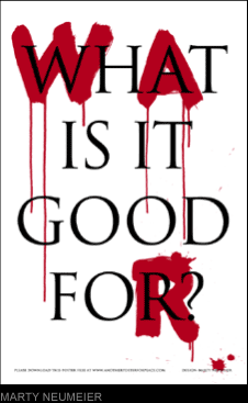
The designer allows content to prevail where it should. He just completed a promotional campaign for the lobbying organization Business Leaders for Sensible Priorities. Founded by Ben Cohen (of Ben & Jerry's), the group is running a 'Move our Money' effort to convince U.S. citizens and government to move 15 percent of the military budget into education and health programs. Cohen met Sagmeister at the famous TED (Technology Entertainment and Design) conference and was instantly drawn to his approach. "He does a great job of integrating content with design," says Cohen. "In our particular case, we had fairly complex, dry content to present, and Stefan helped us simplify it and crystallize it and present it in a way that was entertaining, easy to grasp, and beautiful at the same time." Sagmeister created the campaign's numerous advertising novelties, which include a pie chart logo pin, image-shifting cards that juxtapose current military expenditures with their education and health-care equivalents, a tour bus covered in $100 bills, and 16-foot-high inflatable bar graphs that puff up to reveal outrageous spending statistics.
Sagmeister's new mindset comes on the heels of having stepped behind a camera for the first time. Last month, he co-directed the music video for Lou Reed's "Modern Dance" with Austrian filmmaker Robert Pejo. In the video, a chicken-suited Reed stands on a kitschy baroque stage and gets plucked and boiled as two women shift cartoon-like backdrops from behind.
But don't expect him to direct any Perdue spots soon. For now, audiences won't even be seeing much more from Sagmeister on MTV or on CD covers. On May 1, he closed his doors to all clients for an entire year -- or so he claims -- in the hopes of finding fresh inspiration for work he feels has become "weaker" and "less fun." Both excited and nervous, he calls the sabbatical his favorite project to date. He'll devote the time to "happy experiments," testing out seedling ideas he never had the time or energy to pursue -- all for the sake of future design pieces, of course. "Some people said, 'Oh you're going to become a fine artist now and do exhibits and stuff,'" Sagmeister says. "But I have no desire to do that. I really like design and I'm going to stay with it."
Title: S=STYLE (+ CONTENT)
By: Diaz, Ann-Christine, Advertising Age's Creativity, 10729119, May 2000, Vol. 8, Issue 4
database: business source premier