Tuesday, May 11, 2010

The Design of the Boarding Pass


Designer Tyler Thompson responded to a blog entry by Dustin Curtis about how boarding passes are designed so poorly. So, he went through and posted different boarding passes for different airlines and talks about the issues each boarding pass comes across aesthetically.

source

Sagmeister quotes

"There are many advantages to CD covers as opposed to all other designs," he says. "If we put a lot of our love and affection in the project, it's not going to get thrown away afterward. CD packages and book covers are the only pieces of graphic design that stay in people's houses and become part of the furniture”(Hot designer matches concepts to music, Don Jeffrey, 97).
. "I love to design CD covers because the medium is so great," Sagmeister says enthusiastically. "They're small. You can put a ton of work into them so that the design has a real connection to the contents. They are one of the few forms of packaging that doesn't wind up in the garbage--every-body keeps them. People really appreciate it when the design enhances their experience of listening to the music." Title: Shaking it up
author: Sherr, leslie
Print, 00328510, mar/apr96, vol. 50, issue 2
database: Academic search premier

Works Cited: Stefan Sagmeister

Works Cited
"- Sagmeister, Inc. -." Relocate. Web. 10 May 2010. .

"Gravity Free Speaker: Stefan Sagmeister." Exhibitor Online ? Trade Show and Corporate Event Marketing That Works. Web. 10 May 2010. .

Heller, Steven. "Stefan Sagmeister." 63.1 (2009): 34-36. Academic Search Premier. Web. May 2010.

Jeffrey, Don. "Hot Designer Matches Concepts to Music." Source Billboard 109.45. Academic Search Premier. Web.

Sherr, Leslie. "Shaking It up." 50.2 (1996). Academic Search Premier. Web.

Versatile


These are the coolest couches I've ever seen. I stumbled across these on stumbleupon.com and it converts from a regular couch to a lounge chaire AND a love seat.

3-D street art that messes with your mind!


When you look at these paintings you wont believe your eyes! They look three dimensional when in reality they're not

"the Meaningful Game" by Tracy Lee Stum
and
Untitled by Marc Spijkerbosch

Nick Brandt, United Kingdom.

His website includes a wide selection of different photographs including the one here.

source

Bio friendly, modern look....all the makings of a successful new product.

"Futuristic"
Artist: Andrew Seunghyum Kim for Coca
Cap is 25% slimmer
66% smaller overall


source

This website is a collaboration of optical illusions and other interesting graphics, which use (for the most part) every day items.

Designs for your MacBook!


* Made from 7 year high quality vinyl
* Measures 9 x 6 inches
* Available in many other colors. Please email color choice or black will be sent.


"We use a durable high grade gloss finish vinyl. Decals are self adhesive making them easy to apply and remove, leaving no residue behind. This material is specifically made for this application and will last a very long time outdoors."


source

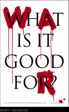
Endless War posters


As always I found an interesting design site title, "Another Poster For Peace", which sells innovative posters that speak to the public about war, which has a negative spin to it. Based in San Francisco.

Designs by Stefan Sagmeister


stefan sagmeister: happy wallet

Saved up 448 wallets and created "happy wallets", which say different words on each wallet

Monday, May 10, 2010

Stefan Sagmeister Video

Stefan Sagmeister


source

Stefan Sagmeister notes cont.

Biography
1962 Born in Bregenz, Austria. His parents own a fashion retailing business. Educated at a local engineering school, then at a college in nearby Dornbirn.
1981 Moves to Vienna. Accepted on his second attempt to study graphic design at the Vienna University of Applied Arts.
1984 Having designed posters for Vienna’s Schauspielhaus theatre with the Gruppe Gut collective, creates the posters for a successful campaign to save the Ronacher music hall from demolition.
1985 Graduates with a first class degree and a $1,000 prize from the City of Vienna.
1987 Arrives in New York with a Fulbright scholarship to study at the Pratt Institute.
1990 Returns to Vienna for community service as an alternative to military conscription. Works in a refugee centre. Posters for Nickelsdorf jazz festival.
1991 Moves to Hong Kong and lands a job with ad agency, Leo Burnett.
1992 Controversy over Sagmeister’s bum-bearing 4As awards poster.
1993 Returns to New York (via Sri Lanka) to work for Tibor Kalman at M&Co. Six months later, Kalman closes M&Co and Sagmeister opens his own studio.
1994 Creates identity for his brother, Martin’s jeans stores, Blue. Nominated for a Grammy Award for the cover for H. P. Zinker’s Mountains of Madness.
1995 Starts collaboration with David Byrne by designing the cover of his Afropea compilation album.
1996 First project with Lou Reed: Set the Twilight Reeling album cover. Emblazons a pair of tongues on poster for AIGA’s Fresh Dialogue talks
1997 Creates Headless Chicken poster for AIGA biennial conference in New Orleans and designs graphics for David Byrne’s Feelings and Rolling Stones’ Bridges to Babylon.
1999 Sagmeister carves the text of a poster for an AIGA lecture at Cranbrook near Detroit into his own torso.
2000 Takes a year off to work on experimental projects.
2001 Reopens studio and publishes the book, Sagmeister: Made You Look.
2003 Designs Once in a Lifetime boxed set for Talking Heads.
2004 Visiting professor in Berlin and unveils Trying to look good limits my life, series of typographic billboards.
© Design Museum

Bibliography
Peter Hall, Stefan Sagmeister, Chee Pearlman, Sagmeister: Made You Look, Booth-Clibborn Editions, 2001
Stefan Sagmeister, Visible Music: CD Jacket Graphics, Gingko Press
Donald Albrecht, Ellen Lpton, Steven Skov Holt, Design Culture Now, Princeton Architectural Press, 2000
Stefan Sagmeister, Postcard Graphics: The Best Advertising and Promotion Design

Source